No results were found matching your criteria

This is the Summary Text field for the Page Title & Intro widget. Settings in the widget allow you to choose whether to display the preview image, pick a background color, and select the layout (image left, right, or wide).
Use the Text Editor widget to feature readable content on the page. The Text Editor widget gives you several options to control the layout of content on the page, including:
See below for more details on how these options control how content displays on the page.
Split into 2 Columns (Text Only): Select "Split Text into 2 Columns" to display body copy in two different columns. Please do not use H2 or H3 headings in split text layouts for optimal usability.
If you select this option, the widget will automatically separate the content into two distinct columns, and will offset the text with a background color. We recommend using this feature to add visual interest on pages or blogs with long body copy and limited images.
Use accordions to collapse content. We recommend using this for descriptive, FAQ-style content.

Use the "content" field in the card widget to display content alongside the image.
The widget allows you to select a background color. The default color is white.
There is a library of built-in spinners. Use these to call out types of content or neighborhoods. In this example, we chose Blog.

Use the "content" field in the card widget to display content alongside the image.
The widget allows you to select a background color. The default color is white. In this instance, we chose grey.
There is a library of built-in spinners. Use these to call out types of content or neighborhoods. In this example, we did not select a spinner.

H: 26° L: 17°
Overcast clouds
H: 36° L: 17°
Overcast clouds

H: 44° L: 30°
Mix snow/rain

H: 51° L: 33°
Light shower rain
H: 58° L: 34°
Broken clouds
H: 49° L: 29°
Sleet
H: 33° L: 24°
Light snow

H: 44° L: 23°
Scattered clouds
H: 32° L: 23°
Broken clouds
H: 51° L: 29°
Mix snow/rain
H: 35° L: 27°
Mix snow/rain

H: 31° L: 23°
Clear Sky
H: 41° L: 33°
Light shower rain
H: 41° L: 35°
Light shower rain
H: 38° L: 33°
Heavy rain
H: 32° L: 26°
Scattered clouds
Use widgets from the "Tempest Shared Widgets" tab to dynamically display content from other areas of the website.

Delta College Planetarium
There are future dates for this event and it is currently underway.
Andersen Enrichment Center
There are future dates for this event and it is currently underway.

Creative 360
There are future dates for this event and it is currently underway.

Zahnow Library - Roberta Allen Reading Room, 4th Floor
There are future dates for this event and it is currently underway.
Shop with Moxie
There are future dates for this event and it is currently underway.
Dow Gardens
There are future dates for this event and it is currently underway.
Marshall M. Fredericks Sculpture Museum
There are future dates for this event and it is currently underway.
Studio 23 The Arts Center
There are future dates for this event and it is currently underway.
Studio 23 / The Arts Center
There are future dates for this event and it is currently underway.

Saginaw Art Museum & Gardens
There are future dates for this event and it is currently underway.
Saginaw Art Museum & Gardens
There are future dates for this event and it is currently underway.
Delta College Planetarium
There are future dates for this event and it is currently underway.
Andersen Enrichment Center
There are future dates for this event and it is currently underway.

Creative 360
There are future dates for this event and it is currently underway.

Zahnow Library - Roberta Allen Reading Room, 4th Floor
There are future dates for this event and it is currently underway.
Shop with Moxie
There are future dates for this event and it is currently underway.
Dow Gardens
There are future dates for this event and it is currently underway.

Marshall M. Fredericks Sculpture Museum
There are future dates for this event and it is currently underway.
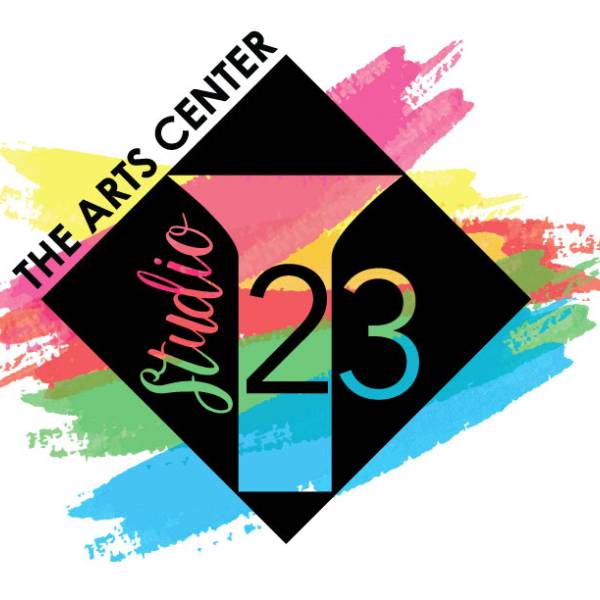
Studio 23 The Arts Center
There are future dates for this event and it is currently underway.
Studio 23 / The Arts Center
There are future dates for this event and it is currently underway.
Saginaw Art Museum & Gardens
There are future dates for this event and it is currently underway.

Saginaw Art Museum & Gardens
There are future dates for this event and it is currently underway.
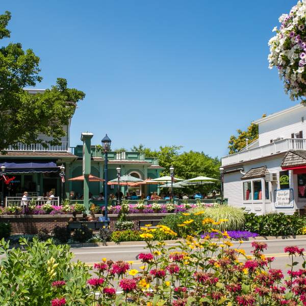
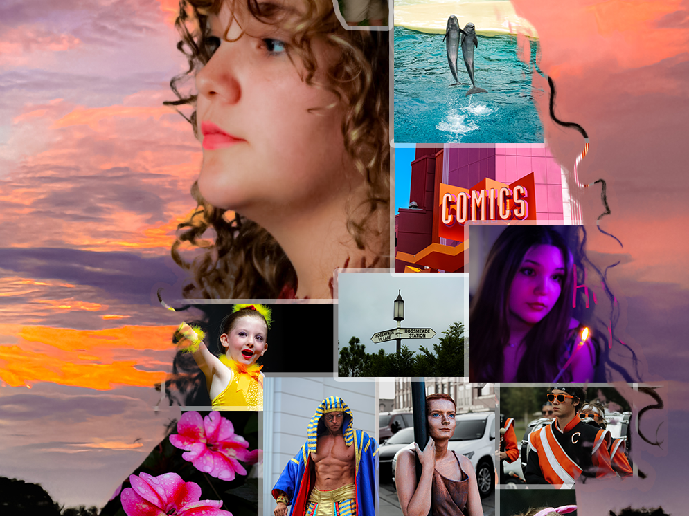
Use this to feature copy and imagery across multiple pages of the site.
This is an image
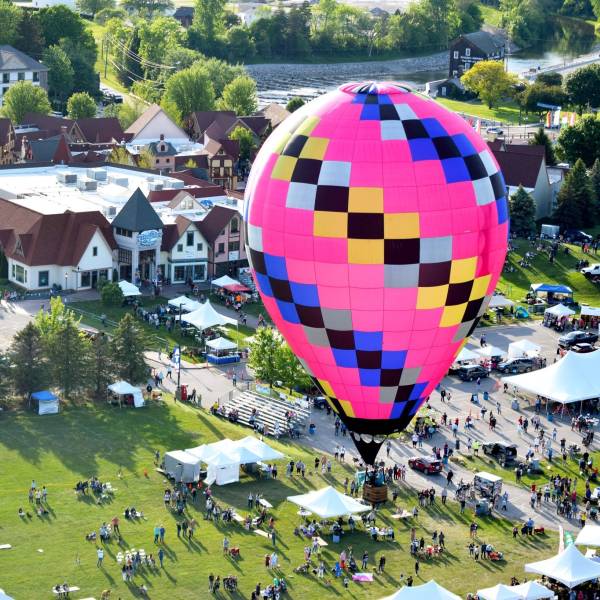
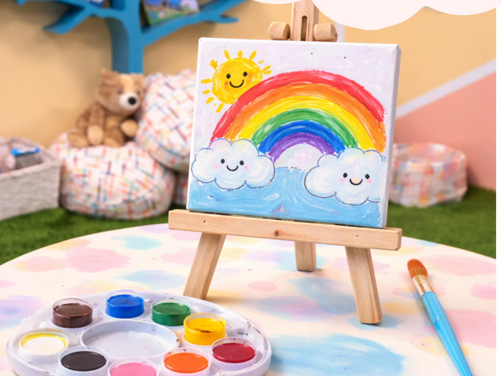
Use this to feature copy and imagery across multiple pages of the site.
This is an image
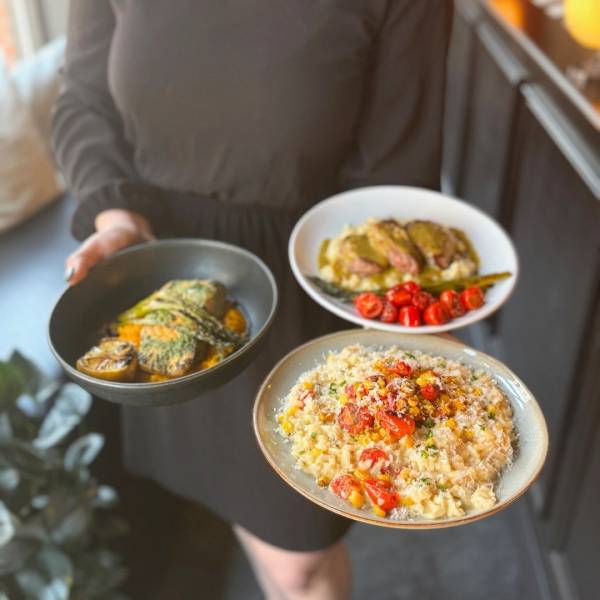
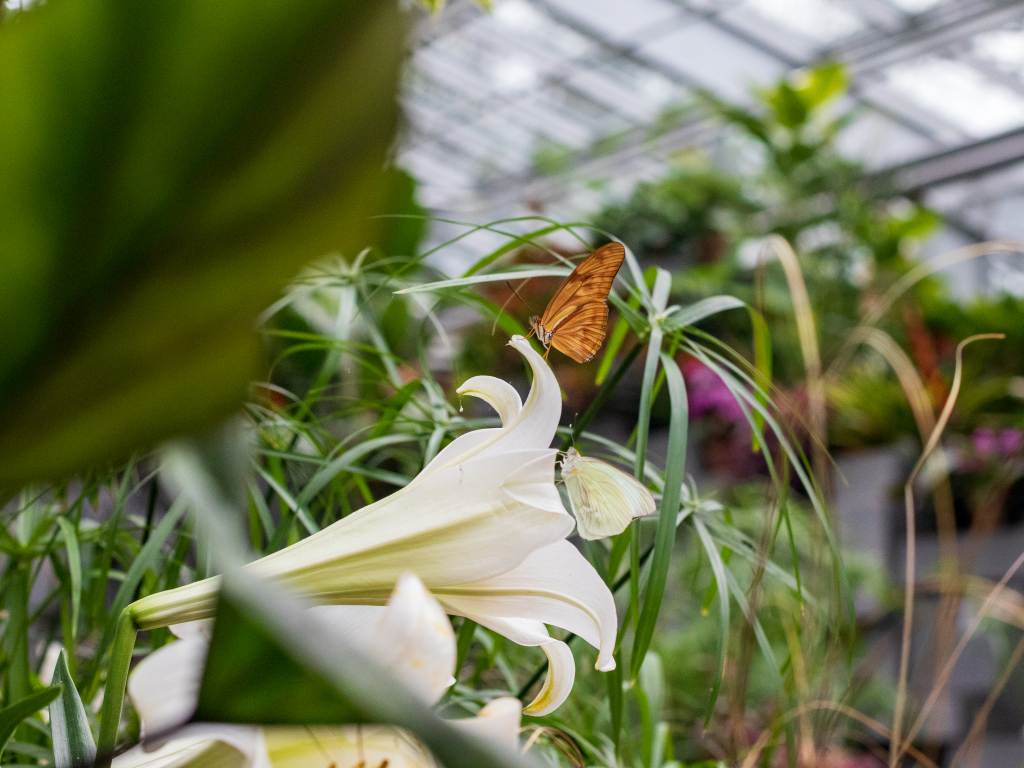
Use this to feature copy and imagery across multiple pages of the site.
Use this to feature copy and imagery across multiple pages of the site.
This is an image

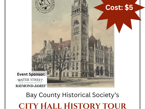
Use the Listing Section widget to display
Once you select the type of listings you wish to display, you can choose to display all listings, or feature specific categories or regions.
The "Settings" tab on the widget allows you to display listings without images, or include images. You can also choose whether to display a map of available listings.
No results were found matching your criteria
Nothing quite compares to the comforts of home — except for retreating to a place that feels like it. And while big,...
Read More +Come together for fireworks & food trucks, live music & local brews — and stay for moments of connection worth...
Read More +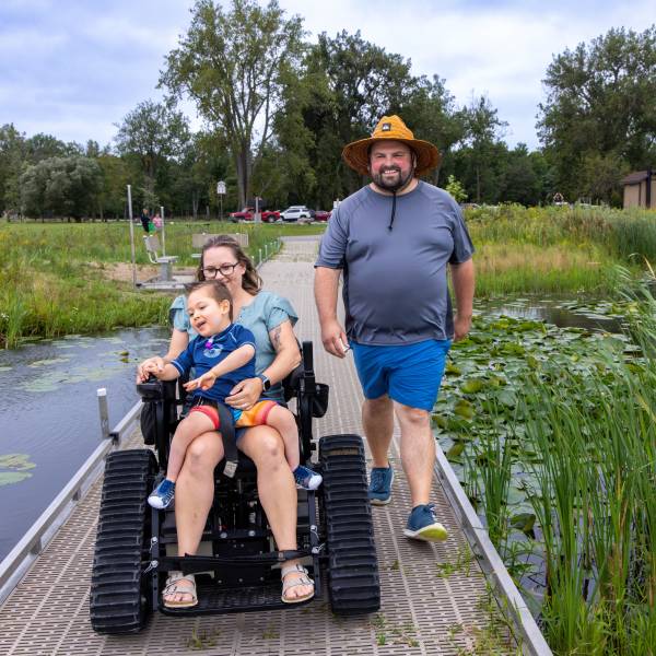
Get your fill of inspiration as you travel our six inviting small towns through these stories.
Read More +If you’re looking for places where comfort food finds its companion in ice-cold pints — or ones where the bites pair...
Read More +